FieldValue
Package@cometchat/chat-uikit-react
FrameworkAstro (with @astrojs/react islands)
ComponentsCometChatConversations, CometChatCallLogs, CometChatUsers, CometChatGroups, CometChatMessageHeader, CometChatMessageList, CometChatMessageComposer
LayoutTabbed sidebar (Chats, Calls, Users, Groups) + message view
PrerequisiteComplete Astro Integration Steps 1–5 first
SSRclient:only="react" directive — CometChat requires browser APIs
PatternFull-featured messaging app with multiple sections
This guide builds a tabbed messaging UI — Chats, Calls, Users, and Groups tabs in the sidebar, with a message view on the right. Good for full-featured apps that need more than just conversations. This assumes you’ve already completed Astro Integration (project created, React added, UI Kit installed).

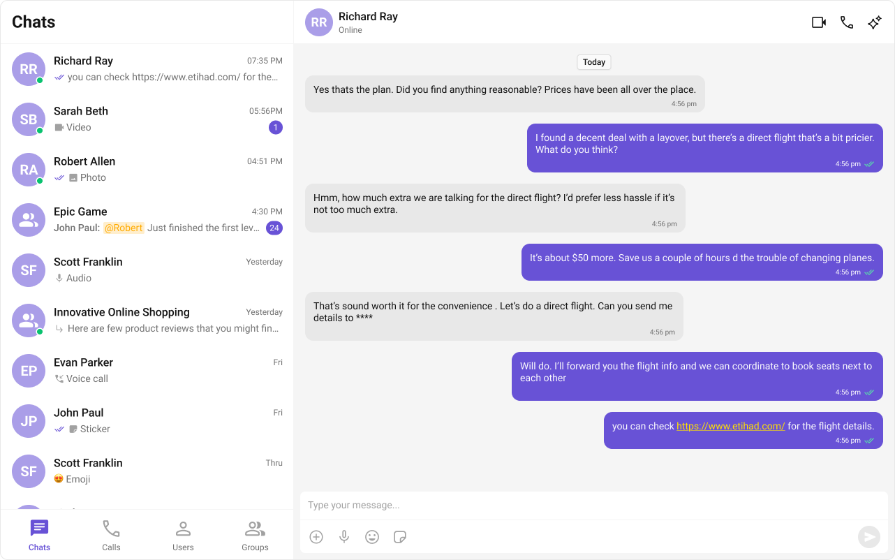
What You’re Building

Three sections working together:
  1. Tab bar — switches between Chats, Calls, Users, and Groups
  2. Sidebar — renders the list for the active tab
  3. Message view — header + messages + composer for the selected item

Step 1 — Create the Tab Component

src
components
CometChatTabs
CometChatTabs.tsx
CometChatTabs.css
Tab icons need to be placed in public/assets/. Download them from the CometChat UI Kit assets folder on GitHub.
public
assets
chats.svg
calls.svg
users.svg
groups.svg
CometChatTabs.tsx
import { useState } from "react";
import "./CometChatTabs.css";

const chatsIcon = "/assets/chats.svg";
const callsIcon = "/assets/calls.svg";
const usersIcon = "/assets/users.svg";
const groupsIcon = "/assets/groups.svg";

export const CometChatTabs = (props: {
  onTabClicked?: (tabItem: { name: string; icon?: string }) => void;
  activeTab?: string;
}) => {
  const { onTabClicked = () => {}, activeTab } = props;
  const [hoverTab, setHoverTab] = useState("");

  const tabItems = [
    { name: "CHATS", icon: chatsIcon },
    { name: "CALLS", icon: callsIcon },
    { name: "USERS", icon: usersIcon },
    { name: "GROUPS", icon: groupsIcon },
  ];

  return (
    <div className="cometchat-tab-component">
      {tabItems.map((tabItem) => {
        const isActive =
          activeTab === tabItem.name.toLowerCase() ||
          hoverTab === tabItem.name.toLowerCase();

        return (
          <div
            key={tabItem.name}
            className="cometchat-tab-component__tab"
            onClick={() => onTabClicked(tabItem)}
          >
            <div
              className={
                isActive
                  ? "cometchat-tab-component__tab-icon cometchat-tab-component__tab-icon-active"
                  : "cometchat-tab-component__tab-icon"
              }
              style={{
                WebkitMaskImage: `url(${tabItem.icon})`,
                maskImage: `url(${tabItem.icon})`,
              }}
              onMouseEnter={() => setHoverTab(tabItem.name.toLowerCase())}
              onMouseLeave={() => setHoverTab("")}
            />
            <div
              className={
                isActive
                  ? "cometchat-tab-component__tab-text cometchat-tab-component__tab-text-active"
                  : "cometchat-tab-component__tab-text"
              }
              onMouseEnter={() => setHoverTab(tabItem.name.toLowerCase())}
              onMouseLeave={() => setHoverTab("")}
            >
              {tabItem.name}
            </div>
          </div>
        );
      })}
    </div>
  );
};

Step 2 — Create the Sidebar Component

The sidebar renders the list for whichever tab is active, plus the tab bar at the bottom.
src
components
CometChatSelector
CometChatSelector.tsx
CometChatSelector.css
CometChatSelector.tsx
import { useEffect, useState } from "react";
import { Call, Conversation, Group, User, CometChat } from "@cometchat/chat-sdk-javascript";
import { CometChatCallLogs, CometChatConversations, CometChatGroups, CometChatUIKitLoginListener, CometChatUsers } from "@cometchat/chat-uikit-react";
import { CometChatTabs } from "../CometChatTabs/CometChatTabs";

interface SelectorProps {
  onSelectorItemClicked?: (input: User | Group | Conversation | Call, type: string) => void;
}

export const CometChatSelector = (props: SelectorProps) => {
  const { onSelectorItemClicked = () => {} } = props;
  const [loggedInUser, setLoggedInUser] = useState<CometChat.User | null>();
  const [activeItem, setActiveItem] = useState<Conversation | User | Group | Call | undefined>();
  const [activeTab, setActiveTab] = useState<string>("chats");

  useEffect(() => {
    const user = CometChatUIKitLoginListener.getLoggedInUser();
    setLoggedInUser(user);
  }, []);

  return (
    <>
      {loggedInUser && (
        <>
          {activeTab === "chats" && (
            <CometChatConversations
              activeConversation={activeItem instanceof CometChat.Conversation ? activeItem : undefined}
              onItemClick={(item) => { setActiveItem(item); onSelectorItemClicked(item, "updateSelectedItem"); }}
            />
          )}
          {activeTab === "calls" && (
            <CometChatCallLogs
              activeCall={activeItem as Call}
              onItemClick={(item: Call) => { setActiveItem(item); onSelectorItemClicked(item, "updateSelectedItemCall"); }}
            />
          )}
          {activeTab === "users" && (
            <CometChatUsers
              activeUser={activeItem as User}
              onItemClick={(item) => { setActiveItem(item); onSelectorItemClicked(item, "updateSelectedItemUser"); }}
            />
          )}
          {activeTab === "groups" && (
            <CometChatGroups
              activeGroup={activeItem as Group}
              onItemClick={(item) => { setActiveItem(item); onSelectorItemClicked(item, "updateSelectedItemGroup"); }}
            />
          )}
        </>
      )}
      <CometChatTabs activeTab={activeTab} onTabClicked={(item) => setActiveTab(item.name.toLowerCase())} />
    </>
  );
};
Key points:
  • The activeTab state drives which list component renders — CometChatConversations, CometChatCallLogs, CometChatUsers, or CometChatGroups.
  • Each list component passes its selection back to the parent via onSelectorItemClicked.
  • CometChatTabs renders at the bottom of the sidebar.

Step 3 — Create the TabbedChat Island

This component handles init, login, and renders the full tabbed chat experience. It runs client-side only via client:only="react".
src
components
TabbedChat.tsx
TabbedChat.css
TabbedChat.tsx
import { useEffect, useState } from "react";
import {
  CometChatMessageComposer,
  CometChatMessageHeader,
  CometChatMessageList,
  CometChatUIKit,
  UIKitSettingsBuilder,
} from "@cometchat/chat-uikit-react";
import { CometChat } from "@cometchat/chat-sdk-javascript";
import { CometChatSelector } from "./CometChatSelector/CometChatSelector";
import "@cometchat/chat-uikit-react/css-variables.css";
import "./TabbedChat.css";

const COMETCHAT_CONSTANTS = {
  APP_ID: "",    // Replace with your App ID
  REGION: "",    // Replace with your Region
  AUTH_KEY: "",  // Replace with your Auth Key (dev only)
};

const UID = "cometchat-uid-4"; // Replace with your actual UID

export default function TabbedChat() {
  const [user, setUser] = useState<CometChat.User | undefined>(undefined);
  const [selectedUser, setSelectedUser] = useState<CometChat.User | undefined>(undefined);
  const [selectedGroup, setSelectedGroup] = useState<CometChat.Group | undefined>(undefined);

  useEffect(() => {
    const UIKitSettings = new UIKitSettingsBuilder()
      .setAppId(COMETCHAT_CONSTANTS.APP_ID)
      .setRegion(COMETCHAT_CONSTANTS.REGION)
      .setAuthKey(COMETCHAT_CONSTANTS.AUTH_KEY)
      .subscribePresenceForAllUsers()
      .build();

    CometChatUIKit.init(UIKitSettings)
      .then(() => {
        console.log("Initialization completed successfully");
        CometChatUIKit.getLoggedinUser().then((loggedInUser) => {
          if (!loggedInUser) {
            CometChatUIKit.login(UID)
              .then((u) => {
                console.log("Login Successful", { u });
                setUser(u);
              })
              .catch((error) => console.error("Login failed", error));
          } else {
            console.log("Already logged-in", { loggedInUser });
            setUser(loggedInUser);
          }
        });
      })
      .catch((error) => console.error("Initialization failed", error));
  }, []);

  if (!user) return <div>Initializing Chat...</div>;

  return (
    <div className="conversations-with-messages">
      <div className="conversations-wrapper">
        <CometChatSelector
          onSelectorItemClicked={(activeItem) => {
            let item: any = activeItem;
            if (activeItem instanceof CometChat.Conversation) {
              item = activeItem.getConversationWith();
            }
            if (item instanceof CometChat.User) {
              setSelectedUser(item);
              setSelectedGroup(undefined);
            } else if (item instanceof CometChat.Group) {
              setSelectedUser(undefined);
              setSelectedGroup(item);
            } else {
              setSelectedUser(undefined);
              setSelectedGroup(undefined);
            }
          }}
        />
      </div>

      {selectedUser || selectedGroup ? (
        <div className="messages-wrapper">
          <CometChatMessageHeader user={selectedUser} group={selectedGroup} />
          <CometChatMessageList user={selectedUser} group={selectedGroup} />
          <CometChatMessageComposer user={selectedUser} group={selectedGroup} />
        </div>
      ) : (
        <div className="empty-conversation">Select a conversation to start chatting</div>
      )}
    </div>
  );
}
How it works:
  • Selections from any tab (Chats, Calls, Users, Groups) flow through the same onSelectorItemClicked callback.
  • Conversation items are unwrapped via getConversationWith() to extract the underlying User or Group.
  • Only one of selectedUser / selectedGroup is set at a time — the other is cleared.

Step 4 — Render the Astro Page

Import the island and hydrate it client-side using client:only="react".
src/pages/index.astro
---
import TabbedChat from "../components/TabbedChat.tsx";
import "../styles/globals.css";
---

<html lang="en">
  <head>
    <meta charset="utf-8" />
    <title>Tabbed Messaging UI</title>
  </head>
  <body>
    <TabbedChat client:only="react" />
  </body>
</html>
The client:only="react" directive ensures the component skips SSR entirely and only renders in the browser.

Step 5 — Run the Project

npm run dev
You should see the tab bar at the bottom of the sidebar. Switch between Chats, Calls, Users, and Groups — tapping any item loads the message view on the right.

Next Steps